
As a computational physicist working in a library, my background and training is quite different to the curators and researchers I now work with. Therefore, I do try to spend some time following developments in the digital humanities more generally, trying to understand the kinds of questions being asked, the techniques that are being used, and the assumptions that lie beneath.
A particularly interesting example came up recently in a blog entry called “Revealing Sentiment and Plot Arcs with the Syuzhet Package” by Matthew L. Jockers.
Sentiment & Smoothing#
This new package sparked a lot of interest, especially the idea of revealing that there are just six-or-seven plot archetypes. But it also received a lot of criticism, particularly around the use of a Fourier-transform low-pass filter to iron out the ’noise’ and reveal the ‘arcs’, but also with respect to the accuracy of sentiment analysis (see e.g. Problems with the Syuzhet Package, Why it’s hard for syuzhet to be right or wrong yet)1.
I agree with much of the criticism, but I think this is still an interesting way of exploring a text, if only as a kind of visualization trick that might let you approach a text in a new way. So I started to think about ways of getting the most out of this kind of data.
The Meaning of Noise#
If we assuming the basic sentiment analysis tactic is of interest, there are two possible sources of ’noise’:
- Algorithmic Noise - arising because the sentiment analysis makes mistakes.
- Narrative Noise - arising from the prose itself, i.e. shifts in sentiment that are present but not part of the overall plot arc.
Neither of these is likely to be the kind of unbiased, random noise than most filtering or smoothing techniques are intended for. In particular, I am very uncomfortable treating the second class of dynamics as ’noise’ - many data sets are echoes of human utterances or actions2 and the quashing or discarding of data points should be carried out with great care.
Instead, my tactic was to avoid discarding or smoothing the data, and to defer any interpretation of ’noise’ as long as possible. My preference is to find different ways to present or project the data that might make any underlying structure clearer.
Summing the Signal#
I’ve spent quite a lot of time staring at time-series data that look very similar to the kind of plots that raw sentence-level sentiment analysis produces. As I looked at the example provided by the Syuzhet blog post:

I realized that a simple but potentially powerful way of re-plotting this data would be to use the cumulative sum rather than the raw value, i.e. instead of plotting the raw values for each sentence, we add-up the ’total sentiment’, sentence by sentence, and plot that instead (what I’ll call the Cumulative Emotional Valence). To test this approach, I first needed to reproduce the raw sentiment data. With a copy of the AFINN algorithm to hand, I came up with this analysis of “A Portrait”
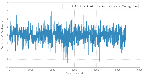
This seems to be similar to the original, which I think is acceptable given that the original was produced using the ‘bing’ rather than the ‘AFINN’ sentiment algorithm.
Performing the cumulative sum, we see how this approach reduces the impact of the ’noisy’ part and makes runs of consistent sentiment much clearer:
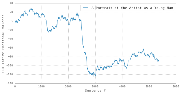
Remember, there has been no rounding or approximation at this stage. Shifting to a cumulative representation loses nothing. It’s a reversible transformation – just another way of looking at the same data.
Indeed, I’m tempted to propose that this cumulative measure more closely approximates the effect of reading a text – the cumulative effect upon the reader seems like a more meaningful perspective to attempt to model, rather than taking each sentence in isolation.
Comparing Trajectories#
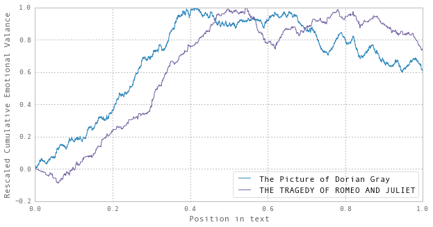
Repeating the same analysis for The Picture of Dorian Gray and Romeo and Juliet, we find:
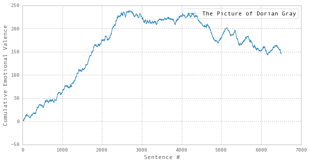
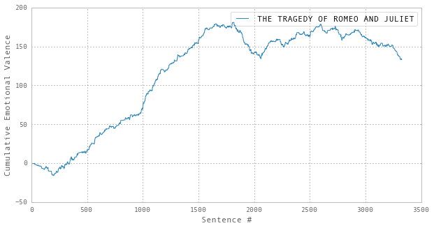
The apparent similarity between the last two is quite striking. Indeed, if you rescale and overlay the two trajectories, the overall forms are rather close:
Statistical Significance#
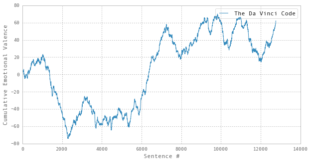
But are these trends significant? For example, if we look at The Da Vinci Code:
…and then compare it with a trajectory of the same length, but generated using randomly generated sentiment values:
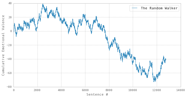
…it’s not immediately clear that the apparent trends in former are any more significant than those in the latter. Therefore, to utilize these methods, the evaluation process must include some analysis of the probably that any given trend could have been generated by a random process.3
Understanding The Noise#
With the above caveat in place, I still think this might be an interesting way of exploring texts. Certainly, the trend for A Portrait of the Artist as a Young Man looks statistically significant to me, and you can imagine how an enriched version of this visualization tactic might actually be quite useful. For example, if we could overlay the chapter boundaries (if any), and add a mechanism to make it possible to quickly get to the text underlying each point on the trajectory, that would make it much easier to see what was going on.
Additionally, as this approach seems to make any apparent order much clearer, I’m much more comfortable with the idea of applying smoothing techniques to the cumulative plots rather than the raw noisy form. If that seems to work well, the accumulation process could be reversed to regenerate the smoothed form of the Emotional Valence data.4
If it’s of interest, my analysis is in this iPython Notebook and I’m happy for any of it to be re-used.
For more details of the discussion on Twitter, see the excellent A Fabula of Syuzhet and A Fabula of Syuzhet II, collected by Eileen Clancy. ↩︎
As Tim Sherratt puts it, “Big data is made up of many small acts of living.”. Or in other words, Big Data is usually Soylent Data. ↩︎
Alternatively, you could keep the sentiment algorithm in place and instead randomize the order of the sentences. ↩︎
We’re actually doing finite-difference calculus calculus here. It’s rather like the analysis proposed in A Sentimental Derivative, but leading with integration rather than differentiation. ↩︎